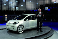
 Theoretically, the up! concept represents VW’s twenty-first century Beetle. Tech wise that may be true as the up! is not only an economical proposition but it also revives the original “people’s car” rear-engine, rear-wheel drive layout. However, the 3.45m long up! comes no where close to the Beetle in terms of emotion.
It’s as if Walter de Silva, Chief Designer of the Volkswagen group was summoned upon by his fellow engineers to draw up a sketch for the up! a couple of weeks prior to the Frankfurt Show opening. Completely soulless and a letdown when compared to


The up! - Key Aspects
Volkswagen Reinvents the Volkswagen
World premiere: Volkswagen up! concept car with rear engine
Multivariable: City specialist offers more space, more variability and more fun
There are cars that endure for all times. They are icons of their type, masterpieces of craftsmanship and technology; they put ideas into motion, make progress tangible and sometimes quite simply make everyday life better, more practical and enjoyable. Many of these cars carry the VW logo. “Bug, Beetle, New Beetle”, “T1, Bulli, Samba bus,
The up! - Concept
The up! is a city specialist, a car for four persons and all languages, for the job, the university, the drive to the beach and the excursion outside the city gates. A small car that shows a lot of size, because it offers more space than any other car of similar length (3.45 meters) and width (1.63 meters). Its engine – conceivable here are all facets of technology that can be sensibly applied – will run in the rear. And that changes everything: Space, mood and design.Walter de Silva, Chief Designer of the Volkswagen group, sums it up like this: “The up! is not a car whose form will become obsolete within a very brief period of time. It shines in its cleverness and yet is made with loving care. And so the up! is a clear and strong statement for future Volkswagen design.” Furthermore, the team of designers and engineers has envisioned the up! concept car as the first member of an entire model line; other facets are entirely conceivable.
Ralf-Gerhard Willner, Director of Concept Development, has final responsibility for the technical layout of the up! He and Walter de Silva had already achieved a new balance in the mutual interaction between form and function at Volkswagen before the start of the project. “Absolute harmony of the basic technological concept and the emotional aspects of the design”, note Willner and de Silva in unison, “can only be achieved in a hard clash of ideas between engineers and designers. That is the only way to produce icons.” That is precisely why the up! is not your run-of-the-mill, small, tightly packed car, but instead is a clever, innovative whole. Its form is pure. It just had to look like this, no other look would do. There is nothing superf luous, and its functionality – and so also its design – speak for themselves. Simultaneously – and this is typical of Volkswagen – uncompromisingly attention was given to refining every line and every surface until we had created a friendly and masterful car.
The up! - Exterior design
The fact that the engine of the up! runs in the rear has a decisive inf luence on its exterior design. That is because the up! has no classic radiator grille. It forges links to the Beetle. This fact alone gives it a great deal of independence. Dominant design characteristics are the headlamps that take an inward and diagonal line, between them the horizontally arranged air vents, the VW logo (as one of the few details kept in chrome), the tailgate that extends far forward and the smooth bumper with a circumferential black stripe as a detail of the “happy face” that is typical of Volkswagen.
In many areas, technology and design have melded into a vehicle architecture that is not only appealing, but is also very utilitarian. The rear end of the up! is a good example of this. The tailgate was produced using a transparent material. Under this gate developers also integrated the high layout of the taillights. This is where design and technical-conceptual aspirations come together on the economical car. The goal is to have the rear window wiper clean the taillights too as necessary. Another feature that is technically and visually new is the location of the VW logo in the tailgate; it is also located behind glass and illuminates when the light is on. The rear bumper was designed to match the “happy face” in front.
The powerful appearance of the up!, despite all of its compactness, is emphasized by a very wide track width (1.42 meters) relative to vehicle width. The wheels are flush with the sporty outboard wheel arches and side skirts. The radial design of the wheels and surfaces extending right up to the edge of the rim make the 15-inch alloy wheels appear significantly larger than they actually are.
The wheels that are arranged far outboard in the bumper areas reduce body overhangs to a minimum. All of these features are part of an unmistakable side profile with a very long roof arch as well as clear and large surfaces. Giving shape to its style here are the large doors (with a special space-saving opening mechanism) and the lateral window surfaces, which incline sharply upward at the height of the rear wheel arch and thereby help to form the very independent C-pillar design.
The up! - Interior design
Mounting the engine in the rear opened up entirely new interior concepts. Relative to its exterior size, the space offering is exceptionally forward-thinking. The same is true of its variability: Except for the driver’s seat, all other seats can be folded and removed. Since they are designed as light shells, they can be quickly stowed in one of the cargo areas – besides the front trunk there is also one in the rear – to free up space. Afterwards, the entire passenger compartment length can be utilized as a storage area for especially bulky objects.
To achieve the high level of seating comfort that is usual at Volkswagen, besides their ergonomic design, in the case of the up! this level of comfort is also attained by a simple yet very effective trick: Similar to a self-inf lating air mattress, air can be sucked out of the seat surfaces via a valve. This means that the seats can be adjusted 1:1 to the body anatomies of the occupants who have just taken a seat.
The up! - Intuitive interface
On its up! concept car, Volkswagen is presenting some completely new solutions when it comes to operator controls. Klaus Bischoff, Chief Designer for the Volkswagen Brand, comments on this: “Another reason the up! is so fascinating is because everything, every detail, was thought out anew. In the interior we have a touchscreen with new proximity sensor technology for controlling the navigation, radio, trip computer and climate control systems. It is operated absolutely intuitively. As a result, the most complicated functions can be controlled like child’s play.”
The up! has two central displays. In the cockpit, a 7-inch monitor shows the driver key information such as vehicle speed, fuel level and range, as well as momentary CO2 emissions.
In the center of the instruments – equally easy for driver and front passenger to see and control – an 8-inch monitor shows the way that future human-machine interfaces will look and operate. Here all conceivable functions can be controlled via the mentioned touchscreen, which also reacts via proximity sensor to gestures, i.e. specific hand movements.
Menuing was restocked and reorganized so that people without computer science educations would be able to operate the system. The developers intentionally separated “display” and “control” levels from one another. Always shown on the screen is a control bar with standard functions such as climate control or audio volume control. Developers packaged functions of other higher-order systems – navigation, telephone, radio, Internet, images, movies, etc. – on a display level that has been referred to internally as the “main menu carousel” – a type of virtual carousel. It consists of the icons of different system functions (telephone, navigation, etc.). When the user touches the “main menu carousel” it can be rotated by touchscreen. Visually, this control is just as spectacular as it is intuitive. When the desired function appears on the main menu carousel – such as the telephone – all the user needs to do is move his or her hand to the display to switch over to the telephone menu, thanks to proximity sensor technology. The new type of user control is fun, easy to understand in any cultural environment and very safe. That is precisely what is typical of Volkswagen.


